As a web developer with many years of experience, it was exciting for me to apply my knowledge of accessibility to mobile platforms as part of the 2023 Swiss Accessibility Study – Mobile Apps. Many things felt familiar, others I had to rethink or learn. Below I share some of my experiences and lightbulb moments.
Native vs. user-defined elements
Over the years, my experience as a developer has shown me that the best results in terms of accessibility are achieved in projects where the selection of functionalities is based as closely as possible on what the platform itself offers. In the case of websites, this is the browser where HTML determines the range of elements and functionalities; in the case of apps, iOS and Android offer their own ranges respectively. If you then implement these functions according to the specific programming language, you can confidently rely on the operating system, which is responsible for accessibility here.
The more complex a project is, the more likely it is to reach the limits of the available elements, especially when complex control elements such as accordions, autocompletes or drag and drop are required. These must be programmed manually, with the responsibility for accessibility then resting with the programming team itself. Fortunately, there are many ways to expand standard elements, for example; completely new control elements can also be defined, whereby the effort and complexity naturally increase rapidly. The MS Teams app’s autocomplete is a good example of an accessible search field with search suggestions: when searching for contacts, screen reader users are also told how many results are currently displayed based on the current search text. In the ‘Klapp – School communication’ app, on the other hand, the screen reader remains silent.

The same experience for all: no alternative paths!
The accessibility of these slightly more complex elements is never a coincidence: in-depth knowledge is required to support system-wide functions such as zoom, contrast modes, keyboard operation, etc., and the goal must be pursued consistently and throughout the project. This can lead to significant additional effort, which is why resourceful development teams are sometimes inclined to offer “simplified” variants of complex elements or content to users with additional needs. I strongly advise against this: on the one hand, because there is a risk that the user experience will not only be simplified, but will suffer overall (e.g. because functionalities or even content will be curtailed). On the other hand, because the maintenance of such alternative paths later in the project often leads to considerable extra effort and is quickly forgotten; the initial time savings are not worthwhile. My recommendation is therefore (and this has proven itself to be true over the years): all users should always be able to use the same features and paths (user stories), even if this sometimes requires compromises. Only special cases such as drag and drop, which relies on the use of pointer control by design, sometimes require an additional alternative implementation so that keyboard users are not excluded.
Additional features for alternative input devices
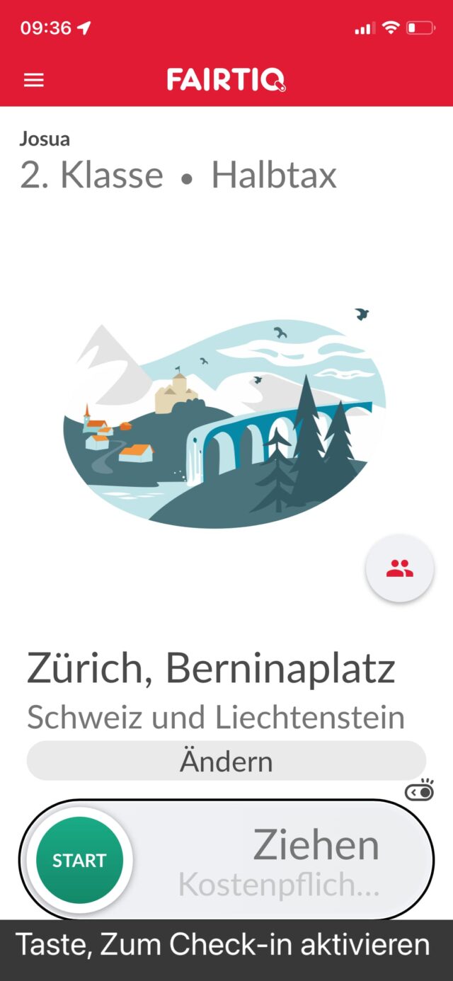
It is common to find different control elements when testing. However, in order to meet accessibility expectations, an element like this must have certain additional functionalities in order to be able to be operated by alternative input devices. One positive example of this is the ‘Fairtiq’ app: the prominent switch to start a journey must be pulled from left to right (swiping gesture). Screen readers do not support this gesture (or use it to move their read cursor); therefore, when the screen reader is active, the switch can be activated with a single click instead of the usual swipe gesture. The situation is different in the ‘Teletext’ app, which also requires a swipe gesture for browsing the pages: for screen readers this is unfortunately the end station (for the aforementioned reason). An additional ‘Show next page’ button would provide a simple and effective remedy.
By the way, because the screen reader is integrated into the operating system, the app can detect whether it is currently active and adjust its functionality accordingly if necessary. A powerful possibility, but one that should be used carefully, in keeping with the above motto: ‘The same experience for all!’
The logic and lack thereof with ‘accessibility modes’
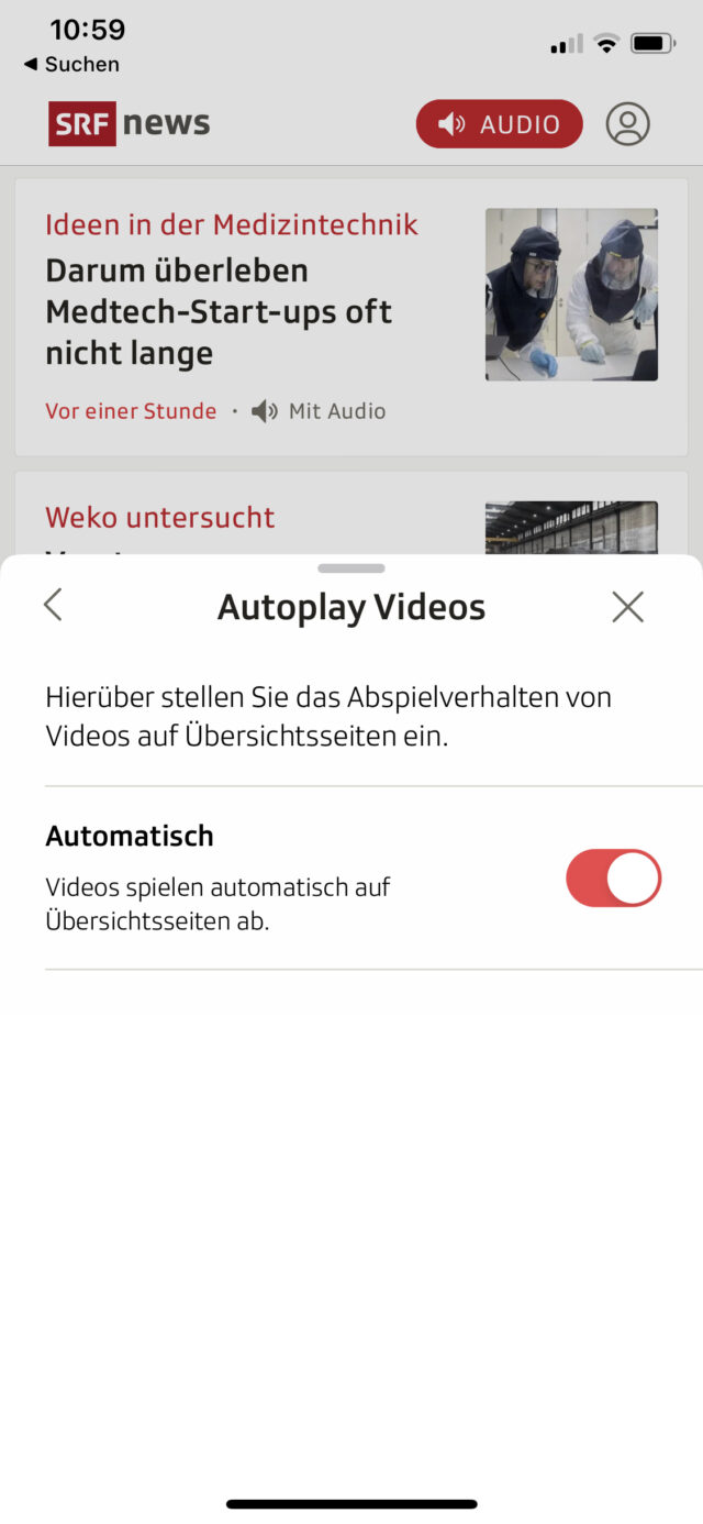
Some apps offer options that promise to improve the accessibility of individual elements for certain user groups. This may be useful if the accessibility of one group would reduce the usability of another group. For example, many users of news apps want audio and video content to play immediately when they open it, but this makes it difficult for blind people to use the app because the audio instructions of their screen reader can be obscured by loud audio content. The SRF News app solves this conflict by offering an option to automatically play or stop such content in the settings area.
However, experience shows that if an app is already prominently promoting a general ‘accessibility mode’ at launch, caution is warranted. This is when I find myself asking: What extraordinary features (or even content) does this app contain that can’t seem to be offered in the usual way, i.e. in a way that works equally for everyone? This may well be the case with graphically complex or above-average interactive apps – typically with games. But this rarely happens with “classic” apps. With this in mind, I was sceptical about the app ‘beook’ which, on starting up, offered to improve the user experience for blind users, among other users, by hiding ‘rarely used’ (undefined) features. In fact, it turned out that this completely removes the global search function as well as the playback of audio and video content – it seems to me – quite relevant functions in an eBook reader! Here, the definition of accessibility has been completely misunderstood – it is about making features accessible to all, not about hiding potentially inaccessible implementations from certain user groups.
An app for those with additional needs – a good idea?
After testing more than 40 apps, my hunch has been confirmed: the more apps have internalised the principle of using the standard features and elements of the operating system, the smoother the result feels even for those user groups that do not use the typical input and output devices. The ‘SBB Mobile’ app proves that such apps can be very appealing both functionally and visually; its clear layout takes users by the hand and guides them through a wealth of content and features without overloading them with information. Nevertheless, SBB has decided to outsource further features (particularly useful for people with additional needs) to the ‘SBB Inclusive’ app. A violation of my motto that all users should always be able to use the same functionalities and paths? Well, if app publishers have good reasons for operating specifics separately, and then implement these consistently (and sustainably), there’s nothing wrong with that. Both SBB apps received very good ratings in our tests – a clear indication that these development teams understand their craft, and it is therefore safe to assume that the high quality standards in the area of accessibility will continue to be met in the future.
As a rule, I advise agencies to develop needs-specific app editions only in exceptional cases. In order to achieve optimum accessibility with as little additional effort as possible, the basic features of the operating system should be prioritised. On this basis, base paths (user stories) can then be defined that work for all app users alike.
About the author

Josua Muheim is an Accessibility Consultant at the ‘Access for All’ Foundation. Josua Muheim is a trained application developer. He joined the foundation in 2014 and learned all about accessibility there until 2018. After a few years of travelling and freelancing, he returned to the team in 2023 and is now responsible for training interns.