Three practical recommendations on an inclusive front-end from the development team behind the “SBB Inclusive” app
SBB launched the SBB Inclusive app in December 2020. SBB Inclusive’s original approach was to digitalise optical customer information at SBB’s railway stations and on long-distance services and to make it available on customers’ personal smartphones. This meant that people with visual impairments could also read or listen to this essential travel information. Additional functions have since been added to SBB Inclusive: there’s a door-knob finder, customer information on tram and bus stops has been integrated into the app and announcements at the station are shown in text format in the app. That’s why the app is also increasingly being used by people with a hearing impediment and is becoming a key general travel aid for people with a disability. SBB Inclusive has already received many awards. In 2020, it won the Canne Blanche award of SZBLIND and the Participants Award at the UIC International Sustainable Railway Awards in 2022. SBB Inclusive became the first app ever to be certified by the ‘Access for all’ foundation in 2022.
But which aspects need to be considered in the front-end to ensure an app is also easy to use for people with visual impairments? It’s an interesting but challenging task. SBB Inclusive’s development team has learned a lot over the past four years: from test users with visual impairments, but also from its own testing of various assistance functions. The three key recommendations are set out below and are illustrated with examples from the code:
Recommendation 1: support enlarged content.
Truncated text can easily be avoided
Many users with visual impairments use the operating system’s option of enlarging text. That’s why supporting various content sizes is important.
When testing an app with enlarged text, some content is always truncated. This is easy to rectify in most cases by enabling the app to display multi-line text.
However, that’s not desirable sometimes, such as with the buttons. That’s why it’s advisable to select short text for naming elements as far as possible and – as a compromise – restrict the maximum font size for some texts and leave the display to the operating system. However, a restriction on the font size is not ideal for people with impaired sight as the text may be displayed in a font that’s too small for them. That’s why it’s advisable to shorten naming elements, arrange the design of the buttons differently and allow multi-line content.
Enlarging text often means the entire text no longer fits onto the screen. Users with visual impairments are used to this kind of display. If a text could run over several lines when significantly enlarged, using ScrollViews is recommended.
Different layout of elements for enlarged content
Unfortunately, even the simplest designs don’t always work for all text sizes. In such cases, it’s best to design an alternative layout where the elements are arranged differently depending on the content size. For example, it may be worth hiding icons to create more space for key information.
Recommendation 2: choose colours carefully.
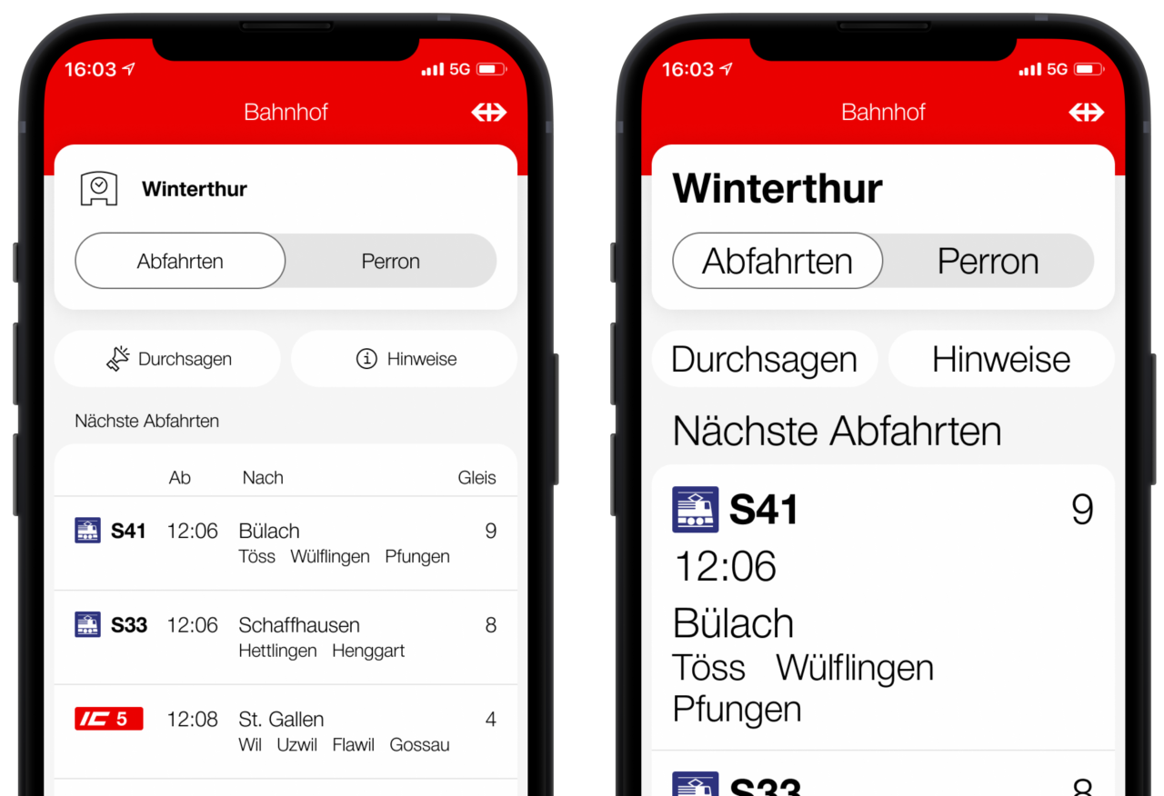
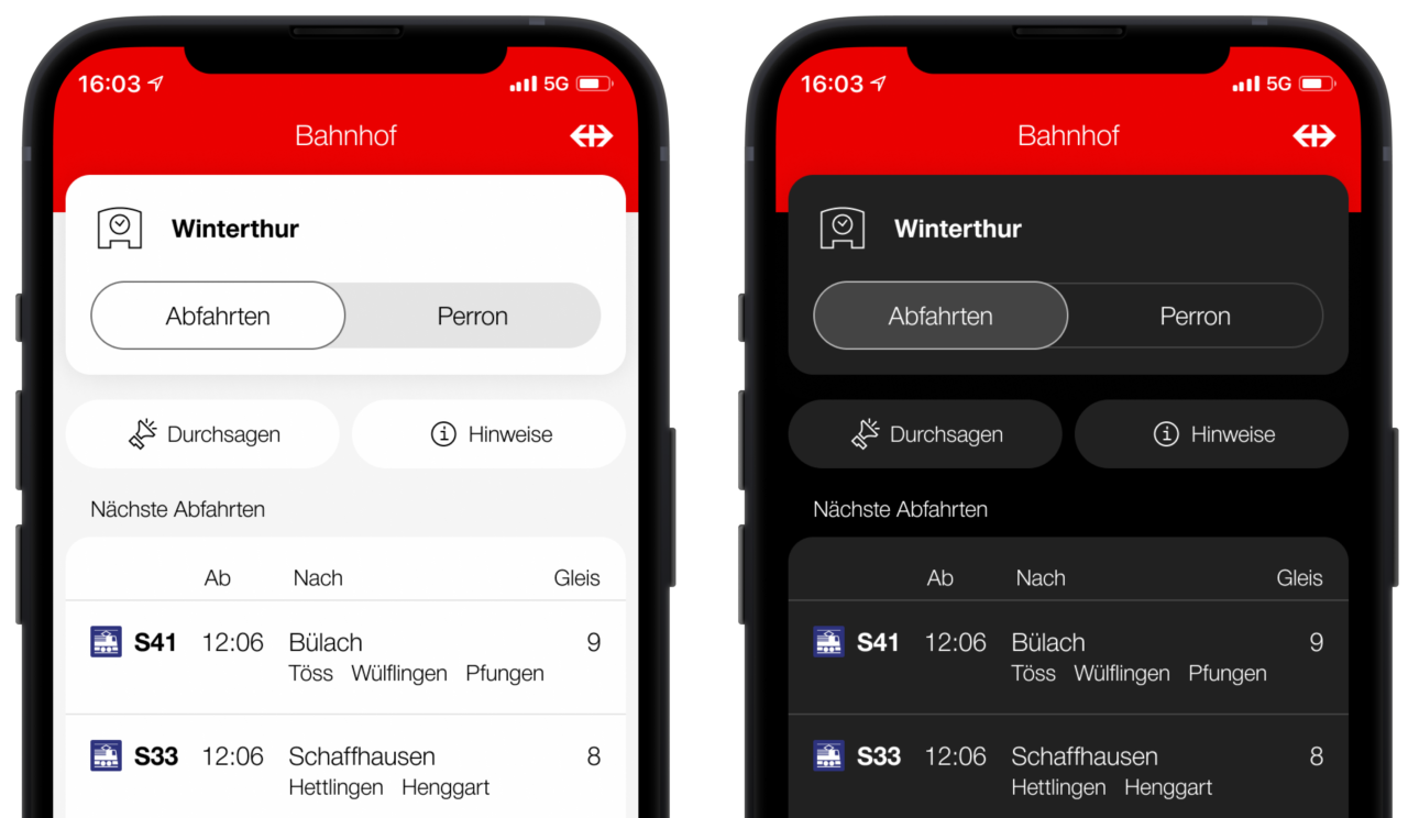
Good contrasts in an app are vitally important for visually impaired people. The use of a colour range with a few carefully selected colours is recommended. Ideally, this range will include foreground and background colours which contrast starkly.
Many users with impaired vision use dark mode to avoid glare. The SBB Inclusive team developed a set of semantic colours to implement their solution. A semantic colour is always used for a particular purpose, for example textBlack for all normal texts in the app. A colour pair is then assigned to the semantic colour for light mode and one for dark mode. This means the colour range only has to be defined once and is then used consistently throughout the app.
Recommendation 3: optimise the app for screen readers.
Learn how to use screen readers
VoiceOver and TalkBack are additional key elements that should be considered when programming an accessible app. It’s a good idea for developers to regularly use screen readers themselves and to add them as a shortcut on their own devices. This gives the developer a feel for what’s really important to ensure good usability of the app. Feedback from test users must also be taken into account: they are the experts when it comes to using smartphones with their impairment.
Hide unimportant visual information
VoiceOver and TalkBack aim to read aloud every individual visually available element. However, this is not always helpful. For example, symbols or images are often used in an app to illustrate text. This repetition is unnecessary for users with screen readers. This information should therefore be hidden for screen readers.
Producing better texts for screen readers
The actual information is often only clear when the individual components are put together. This means this information must also be combined for screen readers.
| Line-by-line information | Combined information |
|---|---|
| “12:39” “12:40” “Flawil” |
“12:39, 12:40, Flawil, …” |
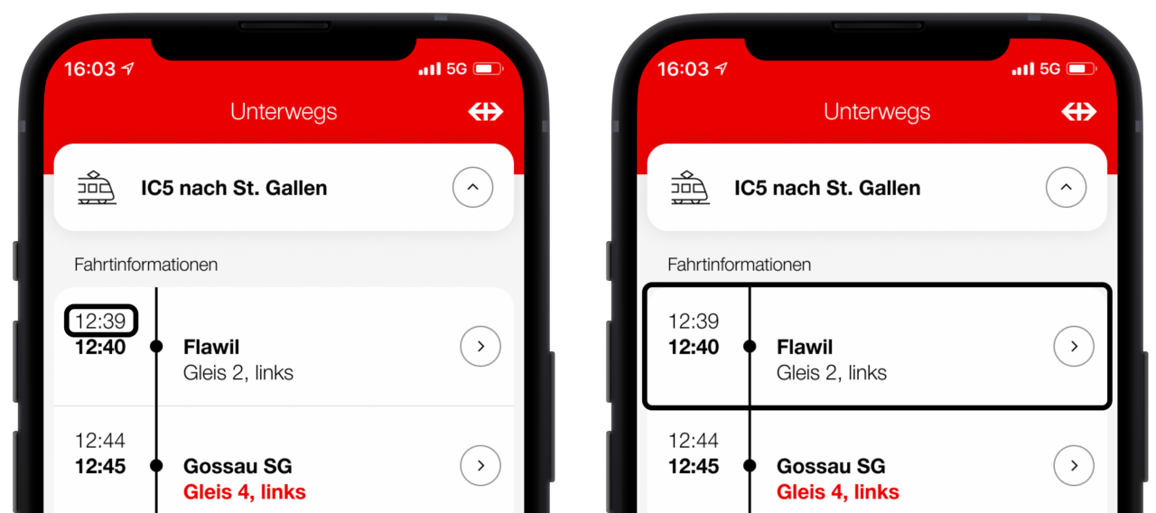
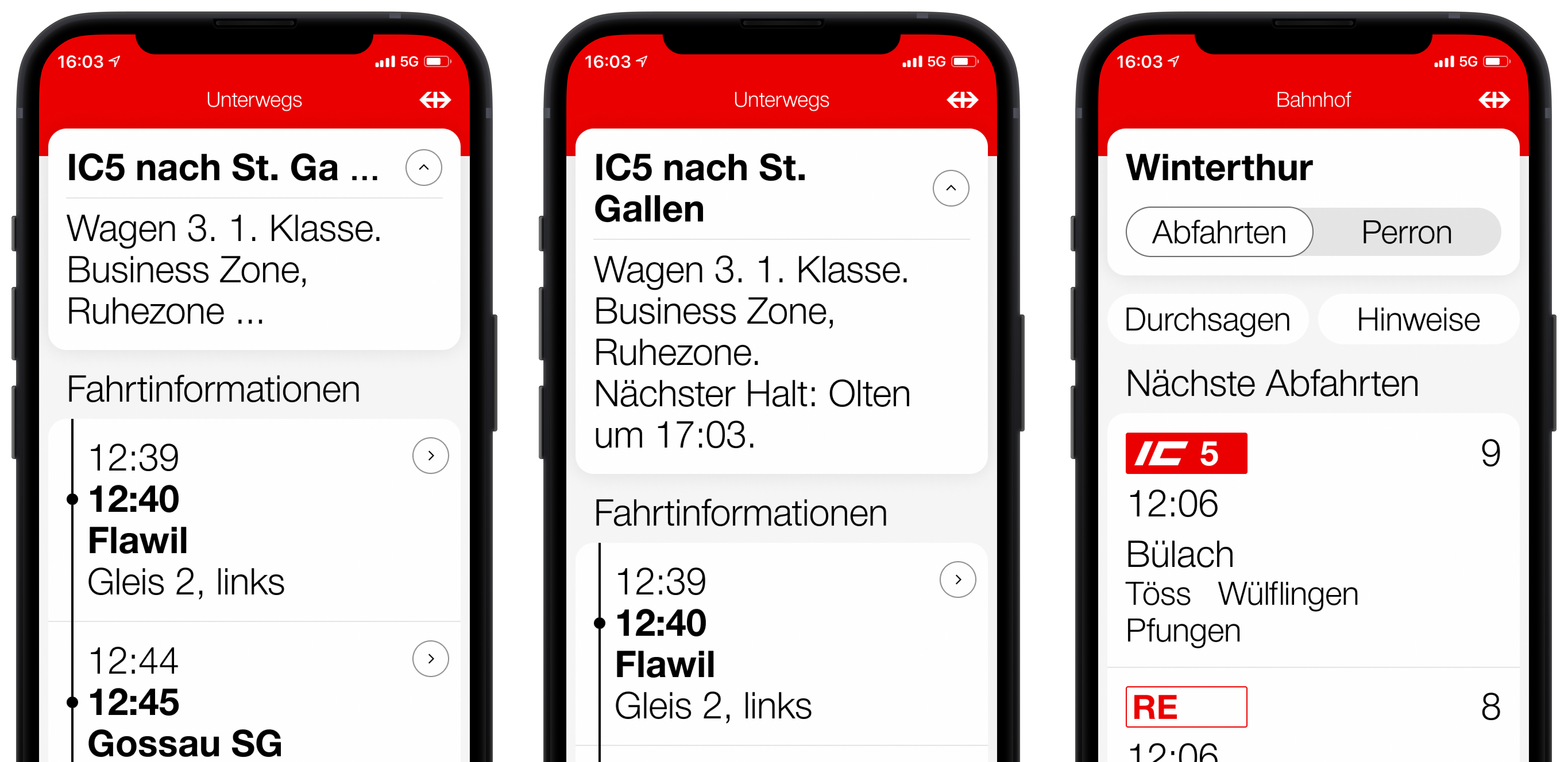
Clever design provides context on the information displayed without explicitly naming it. The screen shown below provides an example: the layout indicates that the train arrives at 12:39 in Flawil and departs at 12:40 but this information is not conveyed expressly in text. These visual dependencies are not evident to users with screen readers which is why additional text must be added as a link element.
| Before | After |
|---|---|
| “12:39, 12:40, Flawil, …” | “Flawil, arrival at 12:39, departure at 12:40, on platform 2, exit left” |
Unfortunately, this cannot be achieved with a simple attribute in the code. This is why using a user-defined TextFormatter, which is responsible for producing suitable text, is recommended.
Screen readers enable navigation from title to title to jump to the required content more quickly. This must be designated accordingly in the code.
While the screen readers perform well on both iOS and Android systems, support is required in certain cases. For example, the standard display of times is difficult to understand.
Continual testing by all members of the development team is required to identify cases where VoiceOver and TalkBack do not work perfectly.
Conclusion
Creating an accessible app is reasonably easy if the key principles of digital accessibility are understood and applied. It’s important that these principles are applied during the design stage and that the development team are made aware of them. This minimises additional costs during programming. This also means the app will appeal to a wider audience when launched as it can be used intuitively by people with disabilities. Digital accessibility represents an exciting and highly informative journey offering great added value for users, but also the development teams.
About the authors
This text was first published in August 2020 on the Medium blog of SBB AppBakery. This is an updated and edited version.

Reto Allemann works as a product owner of SBB Inclusive. He is also an innovation manager and supports teams with the agile organisation of work.

Nicolas Brunner was an iOS developer for SBB Inclusive until 2022 and published the basis for this article in a blog post on Medium in August 2020.

Jeanne Fleury has been an iOS developer for SBB Inclusive since 2022.
The developers of SBB Inclusive work at the AppBakery. The AppBakery is an internal SBB agency that creates innovative solutions with new technologies.